Making sparklines with Chart::Clicker
Today we will use Chart::Clicker and Catalyst::View::Graphics::Primitive to create a Catalyst web application for serving sparklines.
Sparklines?
Sparklines are "information graphics". The term was proposed by Edward Tufte, the author of many books on data visualization.
Preparation
First, you'll need to install Chart::Clicker. Clicker is a great-looking charting package that uses Graphics::Primitive.
You'll also need the Catalyst view.
Adding a Graphics::Primitive view to your application is a breeze:
script/yourapp_create.pl view GP Graphics::Primitive
This creates a GP view. You'll need to decide on a suitable way to forward to the appropriate view in your application. Since this view expects to find a Graphics::Primitive object in the graphics_primitive key of the stash, you might forward to the GP view when that key is set.
The Problem
It is fairly common in documents to throw a tidbit of info at the reader. I recently wrote a report on the effects of an ad campaign on our site and included the following sentence:
Our throughput is currently 4.4Mb/s.
When presenting such a measurement to a reader, such as the amount of bandwidth being consumed by your site, it is often desirable to give the number some context. If we wanted to conduct more information to the reader — such as the last 24 measurements — we might resort to a table.
| Time | Mb/s |
|---|---|
| 2008-11-26 16:00 | 5.8 |
| 2008-11-26 17:00 | 5.0 |
| 2008-11-26 18:00 | 4.9 |
| 2008-11-26 19:00 | 4.8 |
| 2008-11-26 20:00 | 4.5 |
| 2008-11-26 21:00 | 4.25 |
| 2008-11-26 22:00 | 3.5 |
| 2008-11-26 23:00 | 2.9 |
| 2008-11-27 00:00 | 2.5 |
| 2008-11-27 01:00 | 1.8 |
| 2008-11-27 02:00 | 0.9 |
| 2008-11-27 03:00 | 0.8 |
| 2008-11-27 04:00 | 0.7 |
| 2008-11-27 05:00 | 1.1 |
| 2008-11-27 06:00 | 1.7 |
| 2008-11-27 07:00 | 2.5 |
| 2008-11-27 08:00 | 3.0 |
| 2008-11-27 09:00 | 4.5 |
| 2008-11-27 10:00 | 5.0 |
| 2008-11-27 11:00 | 4.9 |
| 2008-11-27 12:00 | 4.7 |
| 2008-11-27 13:00 | 4.8 |
| 2008-11-27 14:00 | 4.2 |
| 2008-11-27 15:00 | 4.4 |
Now the reader can contextualize the information. Is the throughput high or low? Was it sustained? Many questions are answered here.
While accurately portraying the information, this might be a bit "wordy" for our needs. Humans are visual creatures and large blocks of text like this don't mean much to our eyes. Your next option would be to generate a chart that presents this information. We won't cover how to do this with Catalyst at the moment. We'll just look at the result for now.
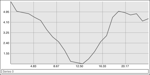
This is a wonderful idea! The data is now presented in a really meaningful way. The problem is that the chart is a very large image for such a small amount of information. Our snippet about throughput was really just supposed to convey that the throughput of 4.4Mb/s was normal.
The Solution
Enter the sparkline!
We'll begin with a standard Catalyst contoller and action:
 package MyApp::Pretty;

 use strict;
 use warnings;
 use base 'Catalyst::Controller';

 sub spark : Local {
    my ($self, $c) = @_;

 }

 1;
Now we'll add the use statements to get Clicker imported:
 use Chart::Clicker;
 use Chart::Clicker::Context;
 use Chart::Clicker::Data::DataSet;
 use Chart::Clicker::Data::Marker;
 use Chart::Clicker::Data::Series;
 use Chart::Clicker::Renderer::Point;
 use Geometry::Primitive::Rectangle;
 use Graphics::Color::RGB;
With that out of the way, we can add the following to our spark action.
 my $cc = Chart::Clicker->new(width => 75, height => 18);

 my @hours = qw(
     1 2 3 4 5 6 7 8 9 10 11 12
     13 14 15 16 17 18 19 20 21 22 23 24
 );
 my @bw = qw(
     5.8 5.0 4.9 4.8 4.5 4.25 3.5 2.9 2.5 1.8 .9 .8
     .7 1.1 1.7 2.5 3.0 4.5 5.0 4.9 4.7 4.8 4.2 4.4
 );

 my $series = Chart::Clicker::Data::Series->new(
     keys    => \@hours,
     values  => \@bw,
 );

 my $ds = Chart::Clicker::Data::DataSet->new(series => [ $series ]);

 $cc->add_to_datasets($ds);
That gets our chart created and the data in it. You'll want to substitute this static data for something dynamic. Since I've no idea where your data is then I will leave it to you.
 my $grey = Graphics::Color::RGB->new(
     red => .36, green => .36, blue => .36, alpha => 1
 );

 $cc->color_allocator->colors([ $grey ]);
This gets our line's color set to grey.
 $cc->plot->grid->visible(0);
 $cc->legend->visible(0);
 $cc->padding(2);
 $cc->border->width(0);
That hides all the decorations around the chart itself.
 my $defctx = $cc->get_context('default');
 $defctx->range_axis->hidden(1);
 $defctx->range_axis->fudge_amount(.2);
 $defctx->domain_axis->hidden(1);
 $defctx->domain_axis->fudge_amount(.1);
 $defctx->renderer->brush->width(1);
Finally, we hide the axes and provide a little "fudge" to make things look nice.
Now we can put the Clicker object into the stash so that Graphics::Primitive will render it for us.
 $c->stash->{graphics_primitive_driver_args} = { format => 'png' };
 $c->stash->{graphics_primitive_content_type} = 'image/png';
 $c->stash->{graphics_primitive} = $cc;
The Graphics::Primitive view defaults to using the Cairo driver. The driver args and content type in our example instruct Graphics::Primitive to render our scene as a PNG. Changein the format and the content type to SVF, PDF or PostScript would yield the same chart in those formats.
The sparkline provides a small but dense view into the data being discussed. In lieu of the methods already discussed, one could place the following:
Throughput is4.4Mb/s.
You'll get this sparkline when you visit the action we made above! (But not the text, that's an excercise left to the reader.)
This is an effective way of providing a wealth of context to the reader without bogging them down sorting out a chart. But we can do much better!
Throughput is4.4Mb/s.
 my $series2 = Chart::Clicker::Data::Series->new(
     keys => [ 24 ],
     values => [ 4.4 ]
 );

 my $currds = Chart::Clicker::Data::DataSet->new(series => [ $series2 ]);
 $cc->add_to_datasets($currds);

 my $currctx = Chart::Clicker::Context->new(
   name => 'current',
   renderer => Chart::Clicker::Renderer::Point->new(
       shape => Geometry::Primitive::Rectangle->new(
           width => 3,
           height => 3
       )
   ),
   range_axis => $defctx->range_axis,
   domain_axis => $defctx->domain_axis
 );
 $cc->add_to_contexts($currctx);
 $currds->context('current');
Here we've added a new series to the chart. We then set the series to use a Point renderer. With this we highlight the "current" point on the chart. We can also change the color of the numeric measurement to provide a visual cue to the reader, tying the number to the point.
Unfortunately, this has flaws as well. The graph gives us enough context to know that 4.4Mb/s is on the high end, but the scale is ambiguous. We can improve this even further:
Throughput is4.4Mb/s (High 5.8, Low 0.7).
 my $series3 = Chart::Clicker::Data::Series->new(
    keys => [ 1, 13 ],
    values => [ 5.8, .7 ]
 );

 my $noteds = Chart::Clicker::Data::DataSet->new(series => [ $series3 ]);
 $cc->add_to_datasets($noteds);

 my $notectx = Chart::Clicker::Context->new(
   name => 'notable',
   renderer => Chart::Clicker::Renderer::Point->new(
       shape => Geometry::Primitive::Rectangle->new(
           width => 3,
           height => 3
       )
   ),
   range_axis => $defctx->range_axis,
   domain_axis => $defctx->domain_axis
 );
 $cc->add_to_contexts($notectx);
 $noteds->context('notable');
You could go a step further and highlight the "normal" range of values:
Throughput is4.4Mb/s (High 5.8, Low 0.7).
 my $mark = Chart::Clicker::Data::Marker->new(value => 2, value2 => 4);
 $mark->brush->color(
     Graphics::Color::RGB->new(red => 0, green => 0, blue => 0, alpha => .15)
 );
 $mark->inside_color(
     Graphics::Color::RGB->new(red => 0, green => 0, blue => 0, alpha => .15)
 );
 $defctx->add_marker($mark);
Conclusion
Sparklines are an effective way of providing a lot of information in a small space. I hope that this introduction will allow you to spice up your application with information-rich snippets. Exploring Chart::Clicker's documentation or reading more on sparklines may give you other ideas.